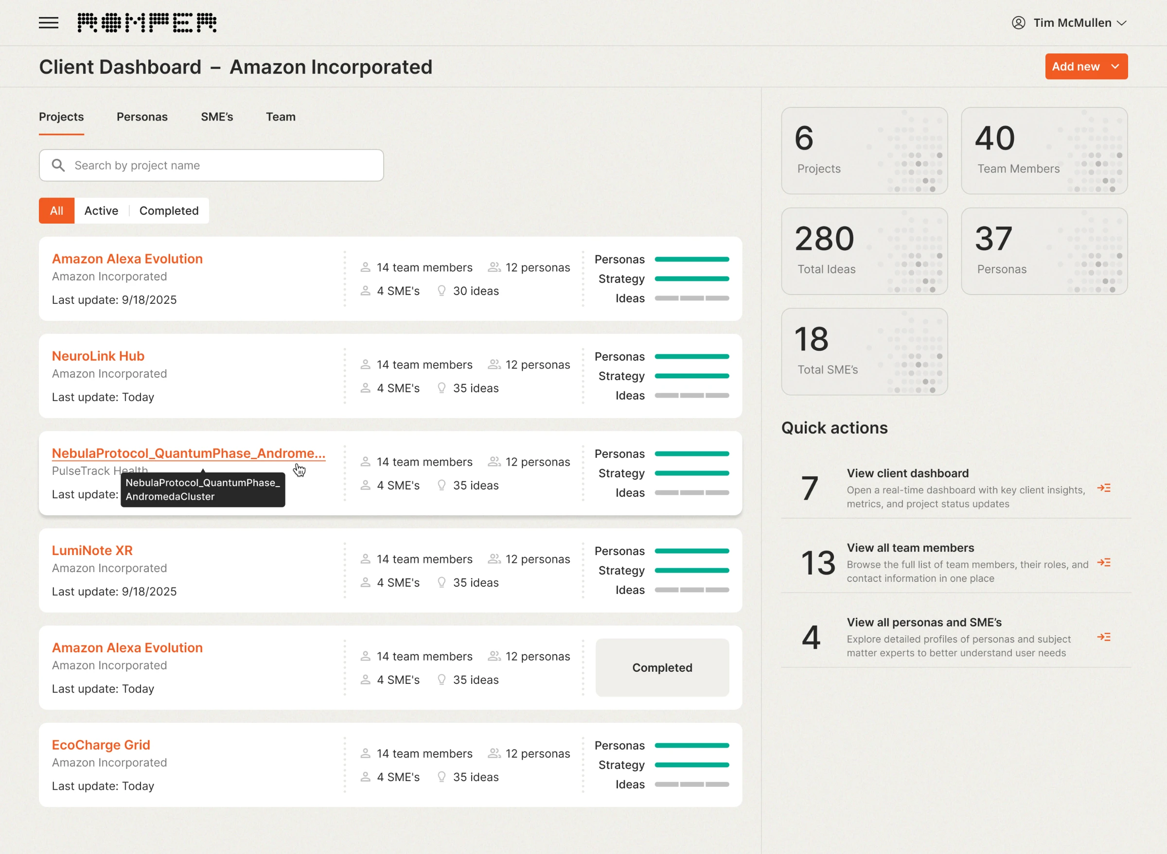
Decision 01
A progress view instead of a control panel
The problem
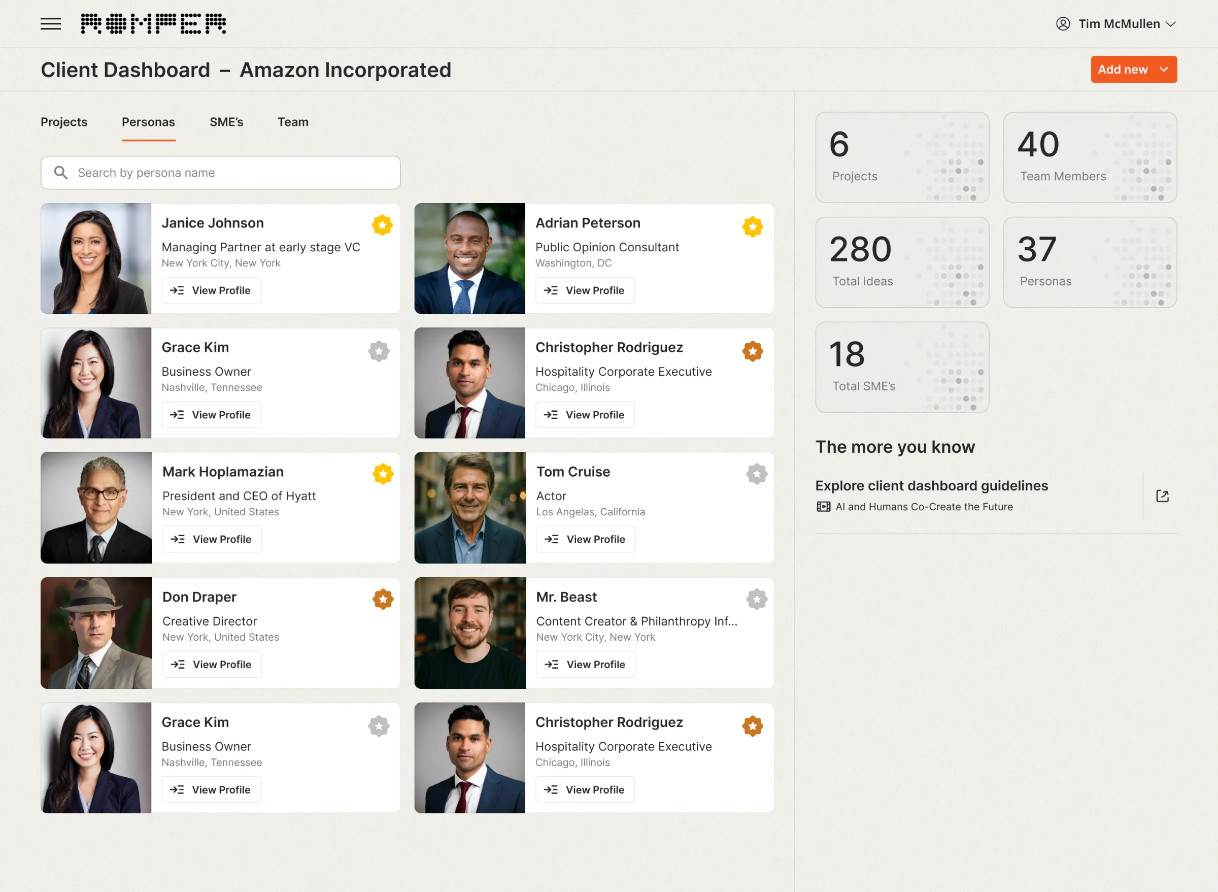
Early versions treated the dashboard as a menu: shortcuts to users, clients and personas, quick actions, counters. They answered "where can I go", while admins came to find out "what is happening".
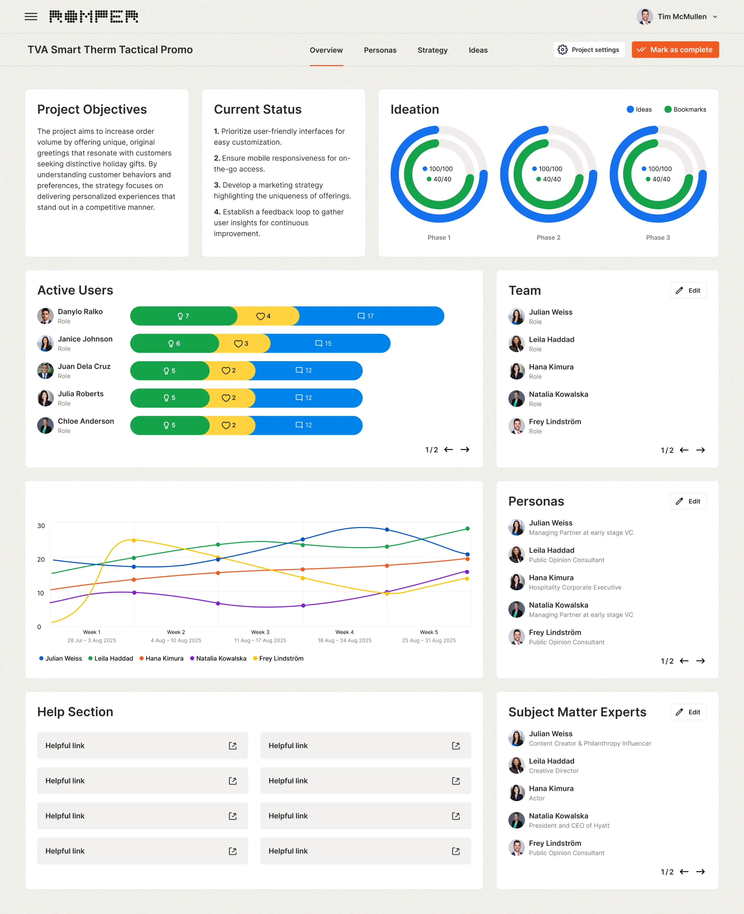
Shipped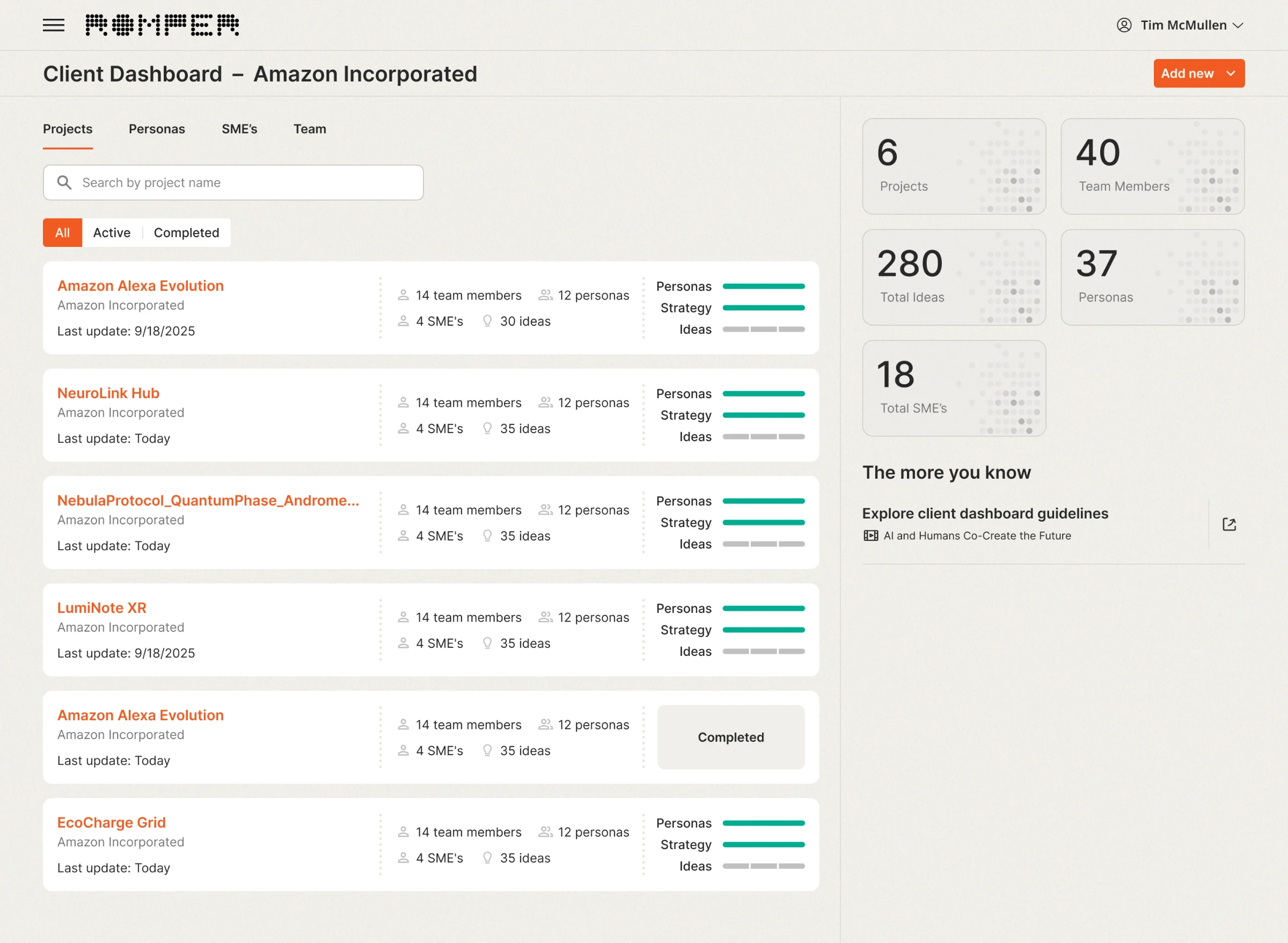
- Rejected
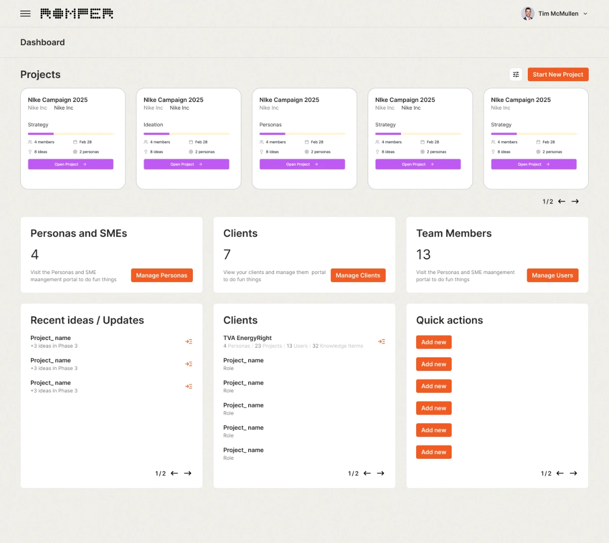
A hub of shortcuts. Six identical "Add new" buttons and one progress bar per project. - Rejected
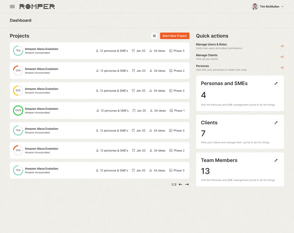
A percentage per project doesn't say which stage the project is stuck in. - Rejected
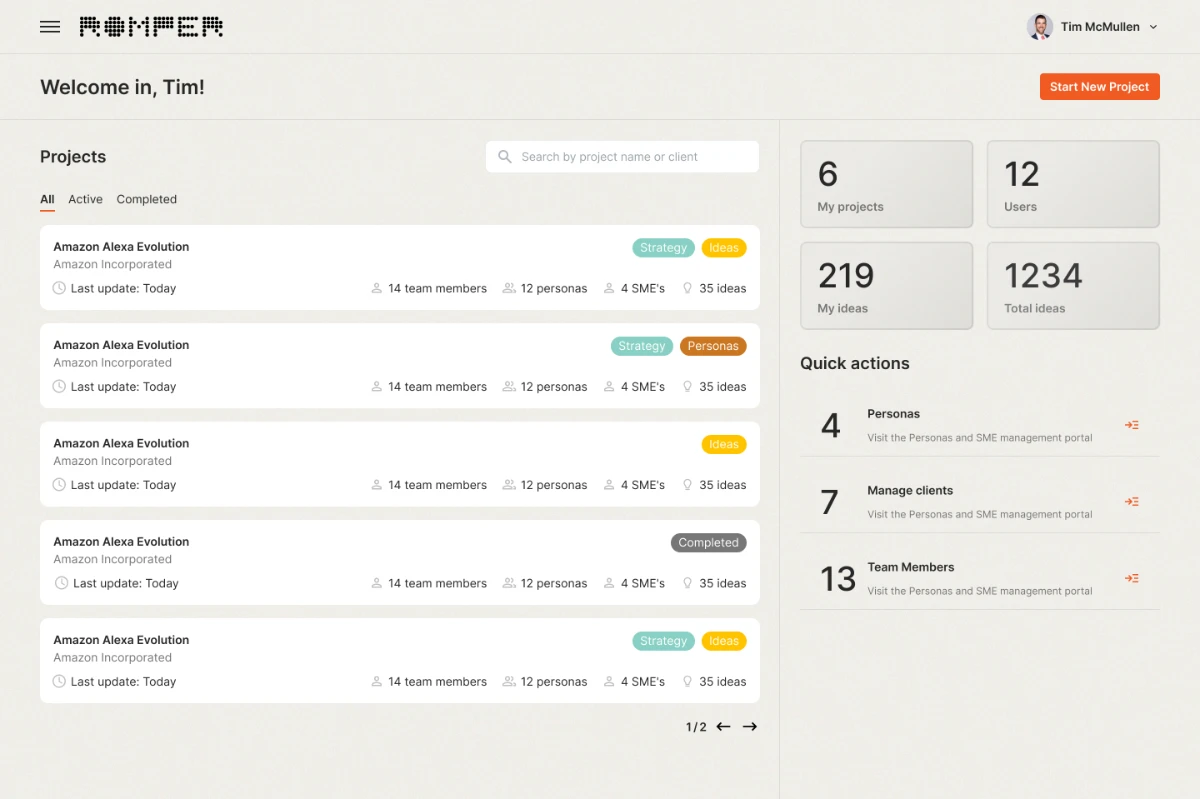
KPIs mixed "my" and "total" numbers, so they were hard to read at a glance. - Rejected
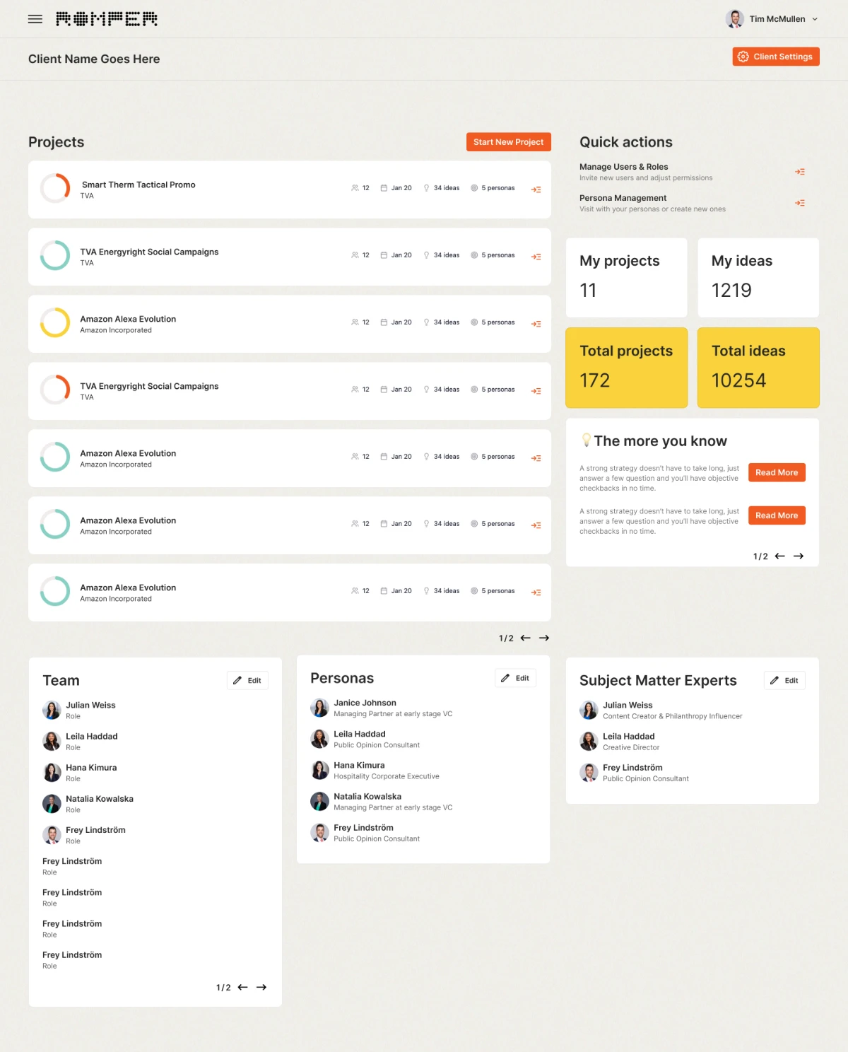
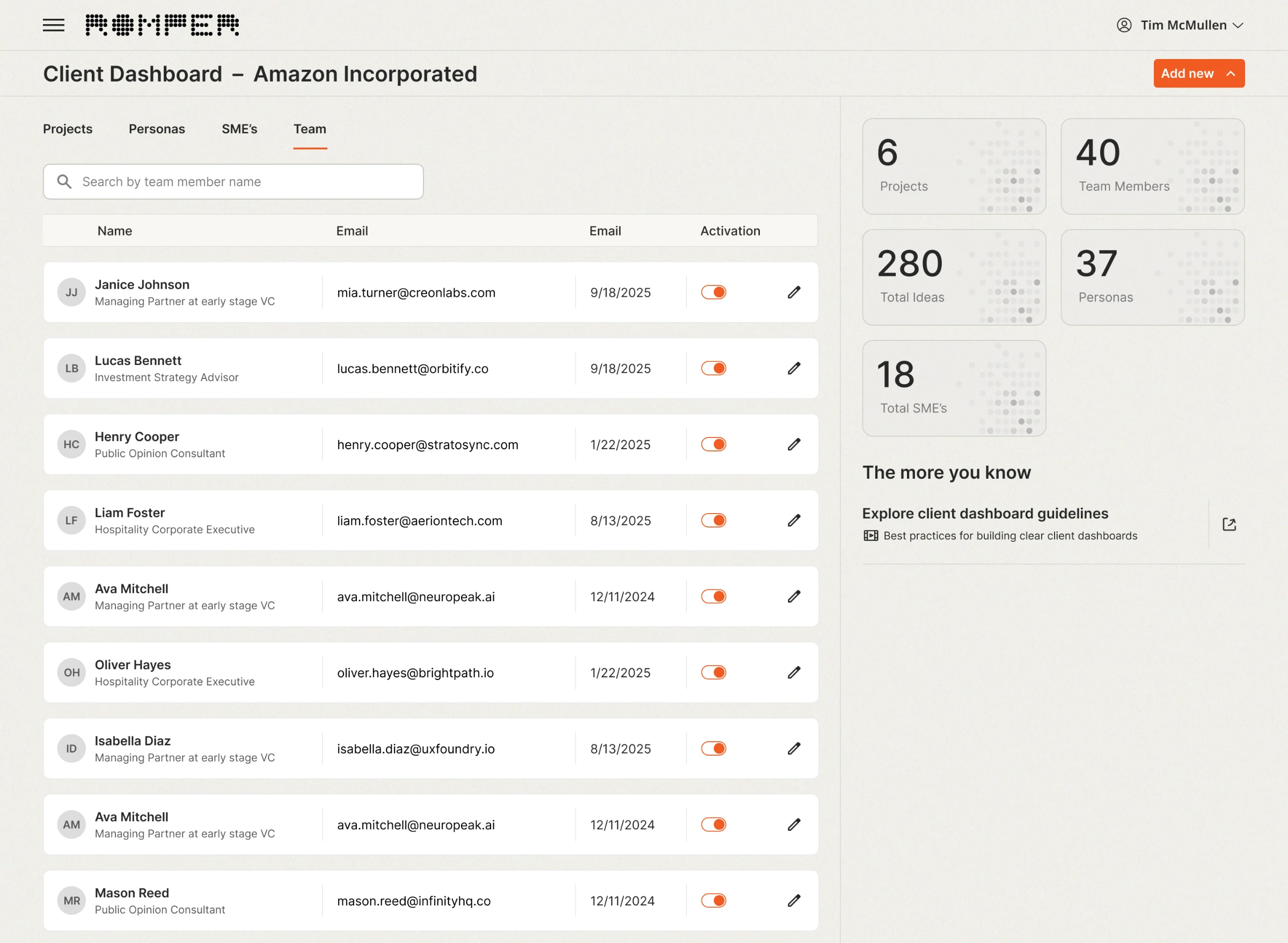
Everything about a client on one page: projects, team, personas, experts, tips. Too much to scan.
Why
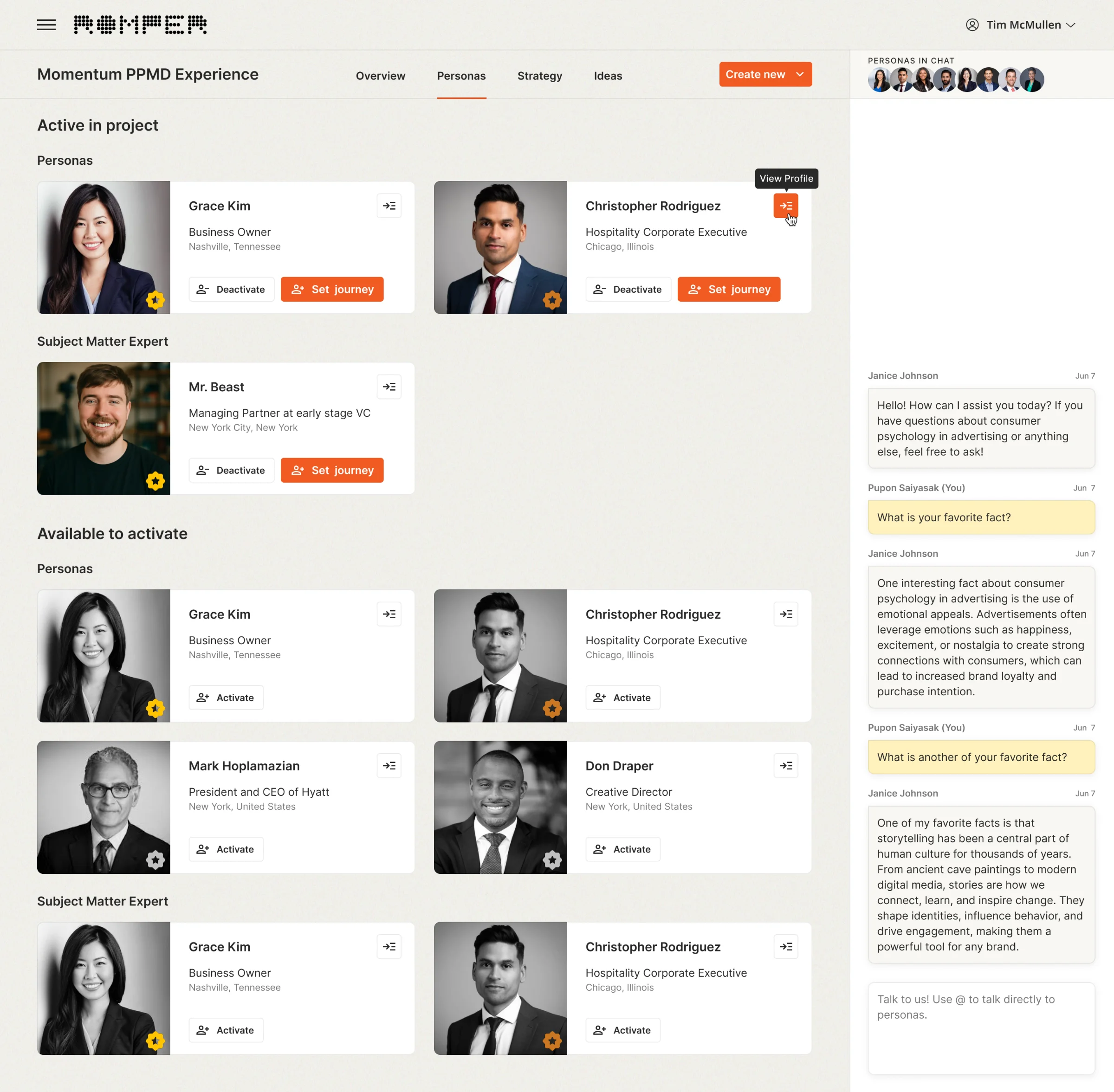
Three bars show where a project is and what's left, which a single number can't. Moving management into tabs freed the main view for progress. The final version went through four iterations and was approved with stakeholders.